
The Pricing Map
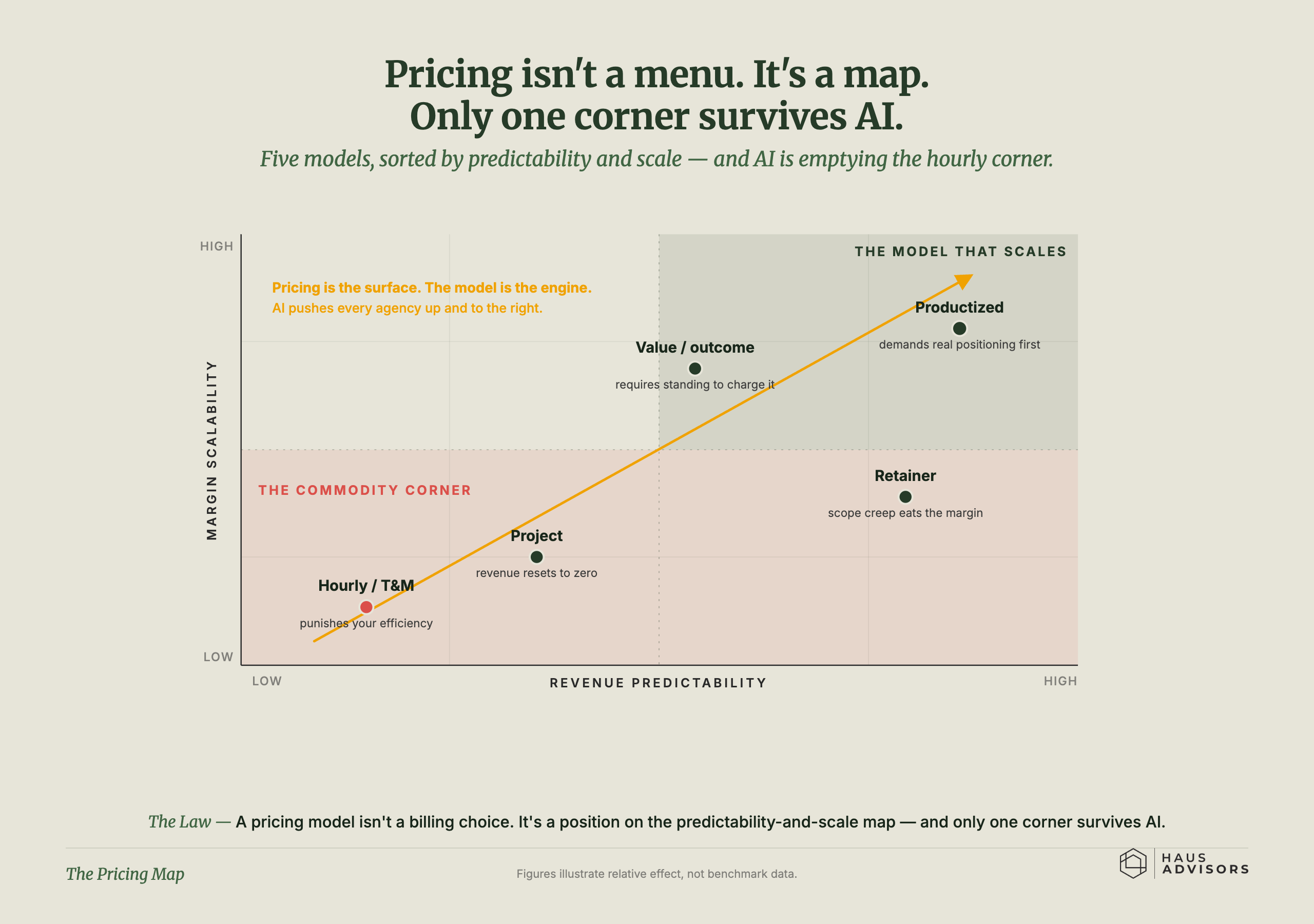
How you charge is a spot on a map, and only the packaged corner keeps its edge as AI spreads.
Save this chart Download
The mechanism
The chart is a grid: left to right is how steady your income is, and bottom to top is how well profit grows as you get bigger. Five ways to charge are plotted on it - hourly and project work sit low and shaky, value and retainer work sit higher, and packaged offers sit in the strong top-right corner. A note explains that AI is emptying the hourly corner, where the work is becoming interchangeable and easy to copy. Your way of charging isn't just a billing choice; it's a position, and the safe corner is the packaged one.
Part of Productization. How you package and price the work.